SEPHORA
As Lead Product Designer, I owned research through the 2018 launch of a 0-to-1 native iOS app, used across every Sephora store in the U.S.
Project Overview
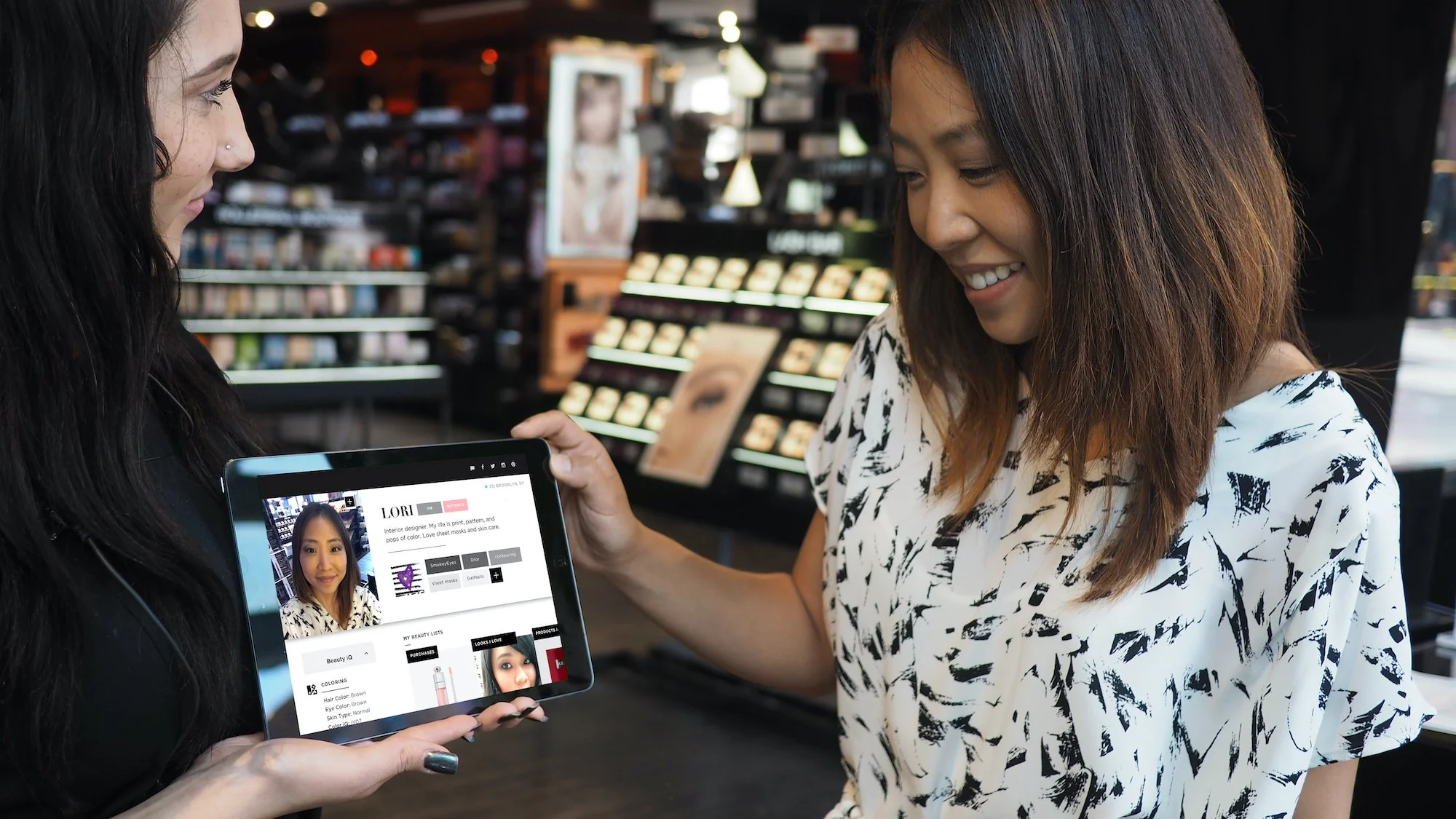
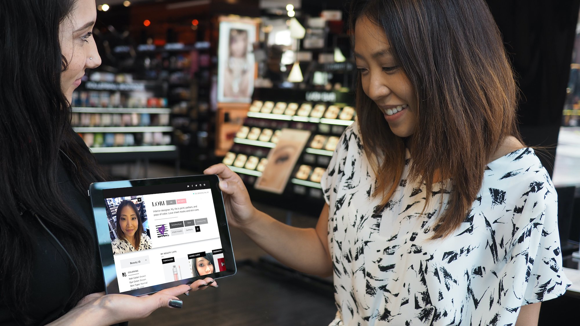
Our goal was to streamline technology into a single "Digital Wingman" for the store floor: one place for schedule, store client data, and access every existing digital tool, so associates could focus on the client in front of them instead of the device in their hand.
-
A native iOS app for Sephora store associates (Beauty Advisors), built from initial research through launch.
-
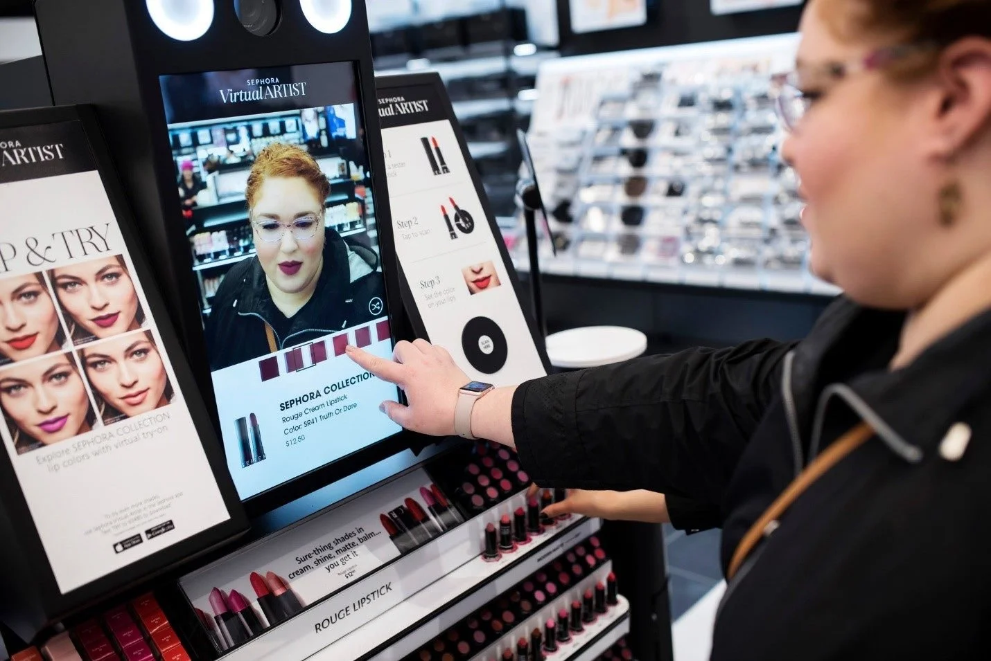
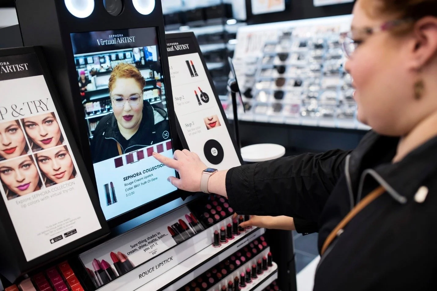
Each store ran 40+ devices, with digital tools scattered unevenly across them. Associates were piecing together a workflow instead of following one, and clients felt the inconsistency.
-
Beauty Advisors across Sephora's store fleet. For the project, we anchored on one representative persona, a mid-level associate working multiple clients a day, to keep design decisions grounded in a real day-to-day.
-
I was the lead ux designer on this project and owned it end to end: generative research, interaction design, information architecture, service design, and stakeholder buy-in across marketing, store operations, store education, and field leadership. I worked alongside UI design, product, engineering, and store operations.
THE PROCESS
Research
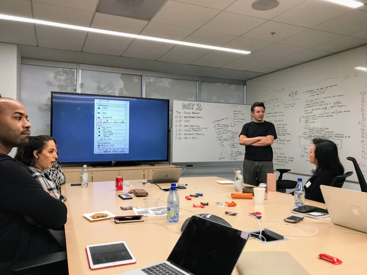
I ran in-person interviews with Beauty Advisors on the floor. Four things came up again and again:
Too many devices, too many apps
No fast access to the information needed to serve a client well
Schedules and store activity tracked on paper, with no visibility into the day ahead
No way to hand off a client to a colleague without making them repeat themselves
DESIGN Principles
Each research finding became a design principle:
One device strategy, not one device per digital experience
Client information at the associate's fingertips
Visibility into schedule and store activity, not paper tracking
The app maps to the real workflow already happening in-store, not the other way around
SKETCH TO SHIP
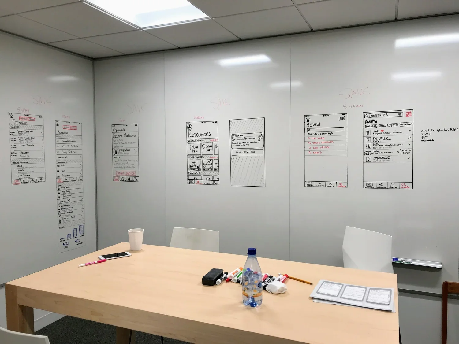
Low-fidelity sketches came first, done on paper with associates in the room to react to in real time. That fed lo-fi wireframes, then hi-fi wireframes incorporating stakeholder and technical constraints, then full UI visual design built in close collaboration with Store Education and Field Leadership.
Launched in 2018 across every Sephora store in the U.S., replacing a fragmented, paper-and-device workflow with one tool built around how associates actually work.
What started as a research problem, too many devices and no shared source of truth, became infrastructure the entire retail organization now runs on.
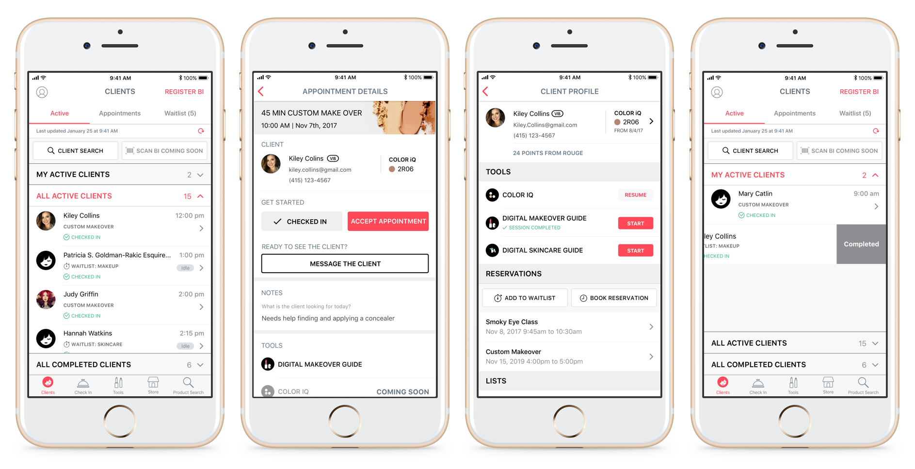
These screens are from the original 2018 launch. The dated look is part of the story: this shipped once and kept running, evolving with associate feedback for years, not a prototype that got shelved.
OUTCOME
This wasn't a digital-only project, and our users weren't just the store associates.
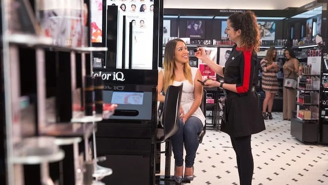
The app had to work inside the physical rhythm of the store, in the interactions and workflows Beauty Advisors were already having with clients.
Part of my work was service design: deeply understanding the existing physical workflows within the store, and then partnering with Store Operations to retrain associates on how to incorporate the new app into a more efficient workflow.
BEYOND THE SCREEN